
3 chart formats for Almanis real-time probability forecasts


The following are examples of the three types of data we present in our newsletters:
A time-series graph
A probability density graph
A data table
Time Series Graph
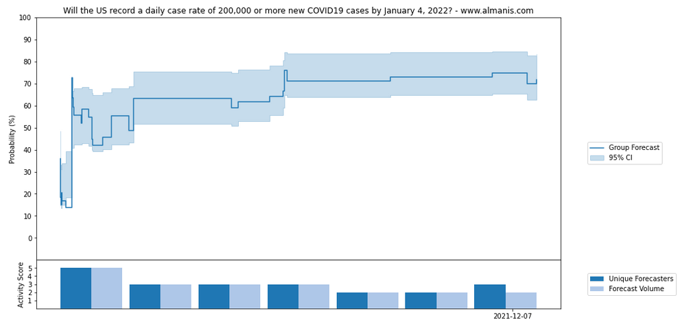
The graph above shows a time series of activity on the question: ‘Will the US record a daily case rate of 200,000 or more new COVID19 cases by January 4, 2022?’.
The solid blue line shows the group forecast through the life of the question. The light blue block shows a 95% confidence interval for the group forecast, which represents the likely range in which the forecast could move if it were to change.
The bar graph below shows the level of activity through the life of the question.
The dark blue bars on a scale of 1 to 5, signal the proportion of forecasters involved in the question, with 5 being a score for the most involvement on the question
The light blue bars showing the volume of forecasts, also on a scale of 1 to 5.
Probability Density Graph
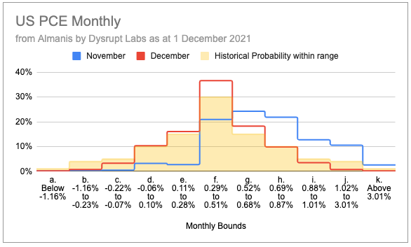
The probability density graph above shows the probabilities for two iterations of the question ‘What will be the month-to-month percentage change in Personal Consumption Expenditure?’ (November and December) at a specific time on 1 December 2021.
These are multiple-choice questions, and the answer option corresponds with a historic probability range, which is shown in yellow. For example:
option a. Below -1.16% encapsulates 1% of historic month-on-month percentage changes,
option b. -1.16% to -0.23% encapsulates 4% of past month-on-month percentage changes, and so on.
The blue line shows the probabilities for each multiple-choice answer to the November question, the red line shows the probabilities for December.
Data Tables
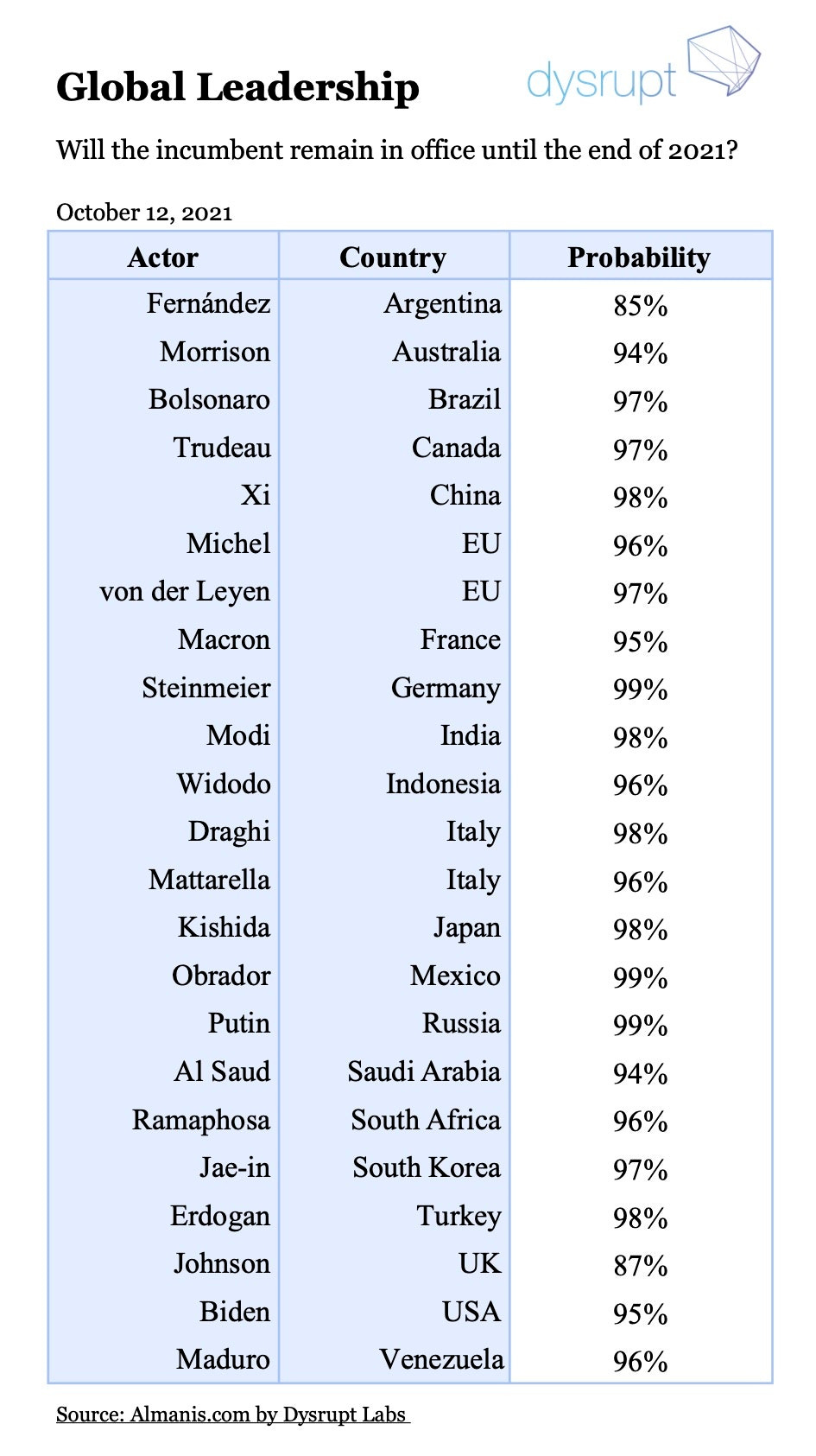
The table above shows probabilities in global leadership as at October 12, 2021.
This is a set of the questions “Will X remain in office until the end of 2021?”, covering the G20 and other key world leaders.
The corresponding probability is taken from a point in time on 12 October.